RE:LAY — Creative System for a Creative Space
A bold modular identity for an urban coworking concept.
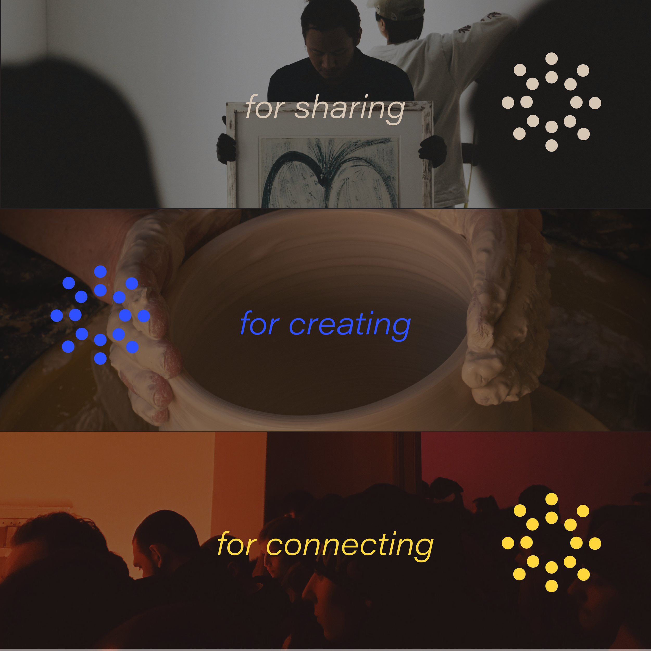
RE:LAY is a fictional creative space concept that blurs the lines between work and culture, productivity and pause. This identity project explores how modular design can express rhythm, energy, and flexibility — while still keeping a distinct visual voice.
From street posters to scheduling tools, RE:LAY lives in motion.
BRANDING
IDENTITY SYSTEM
VISUAL DIRECTION


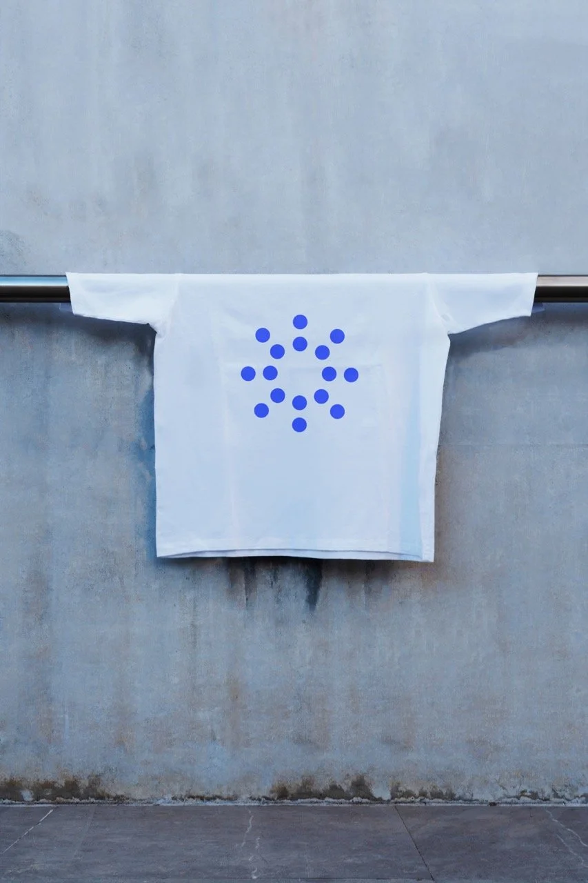
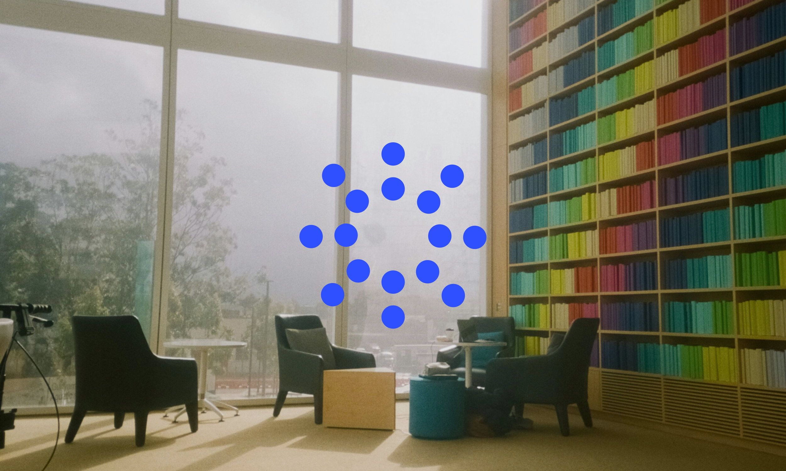
The symbol “:” was used to create the mark of the logo by multiplying it and giving it a sphere shape. This symbol carries the whole essence of RE:LAY since it conveys the connection between things, as well as the pause before something begins. This mark manages to make the symbol “:”, the center of attention, since it seems like an abstract interaction or human connection, while creating a feeling of connection, motion, and community which expresses ideally the concept of RE:LAY.